In a generation where many Gen Z youth are confidently speaking up and shaping the social narrative, the flip side is a tendency to conform to trends and a fear of judgment. This has caused a large number of young people to become hesitant and reserved in expressing themselves. As a result, their unique communication styles gradually fade, and their confidence retreats with it. “Ngôn Dạng” is a campaign that helps you rediscover your communication identity – clearer, deeper, and truly authentic.
In Vietnamese, “Ngôn” reflects how we speak - the essence of language. “Dạng” represents both form and diversity - the many shapes of expression.
“Ngôn Dạng Campaign” explores a variety of personal communication styles, inspired by Dr. Dellinger’s Psycho-Geometrics, where five geometric shapes - Square, Triangle, Rectangle, Circle, and Squiggle - represent different natural communication strengths. This approach serves as the core visual and conceptual foundation for the project.
The campaign concept, “Reflect to ReShape”, draws inspiration from the phenomenon of light bouncing back from a surface. “Reflect”, in this context, is more than a physical process; it represents an inward journey to understand how we communicate with others, whether through habits, preferences, and challenges in communication, and thus, to “ReShape” how we express ourselves — more intentionally, confidently, and true to who we are.
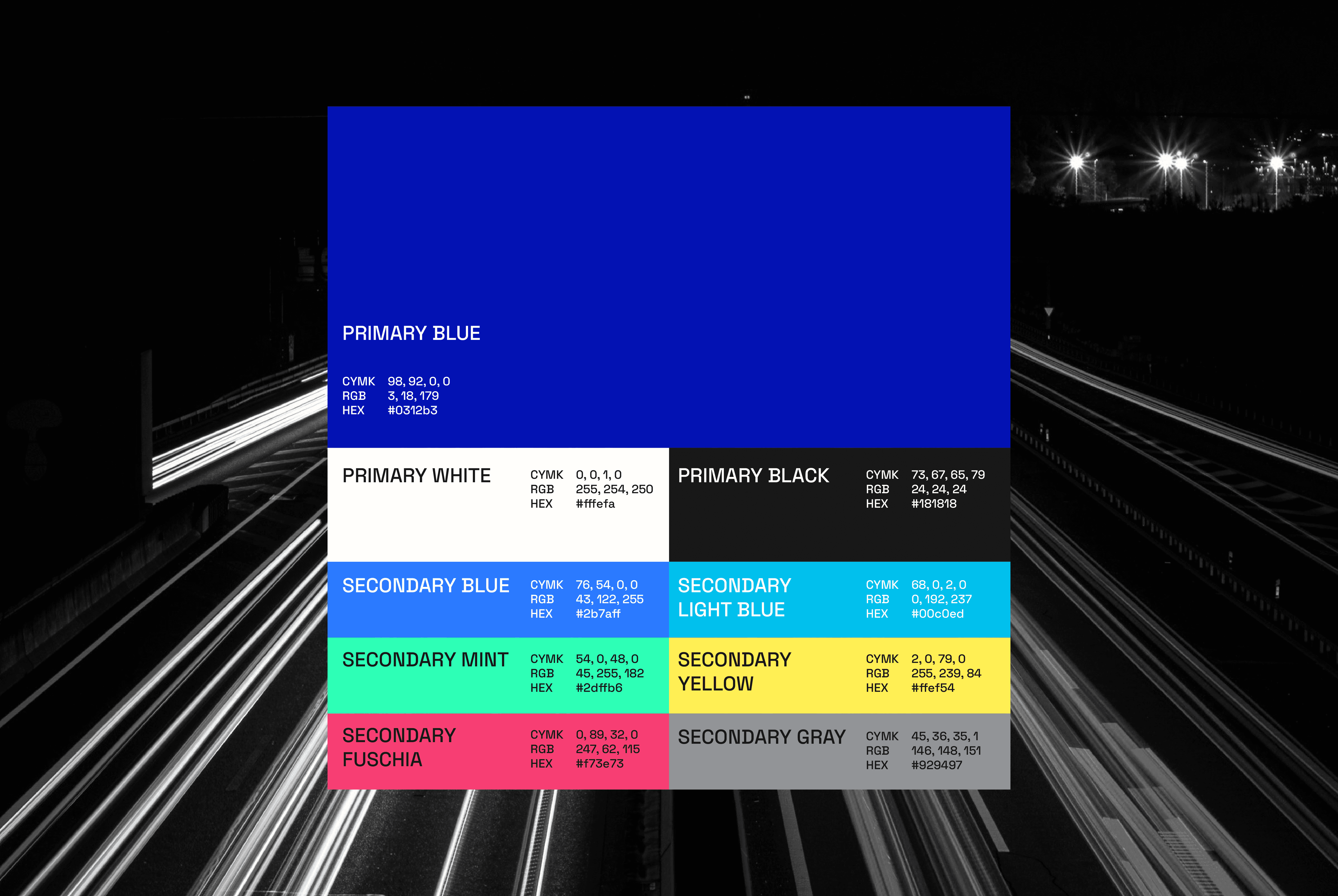
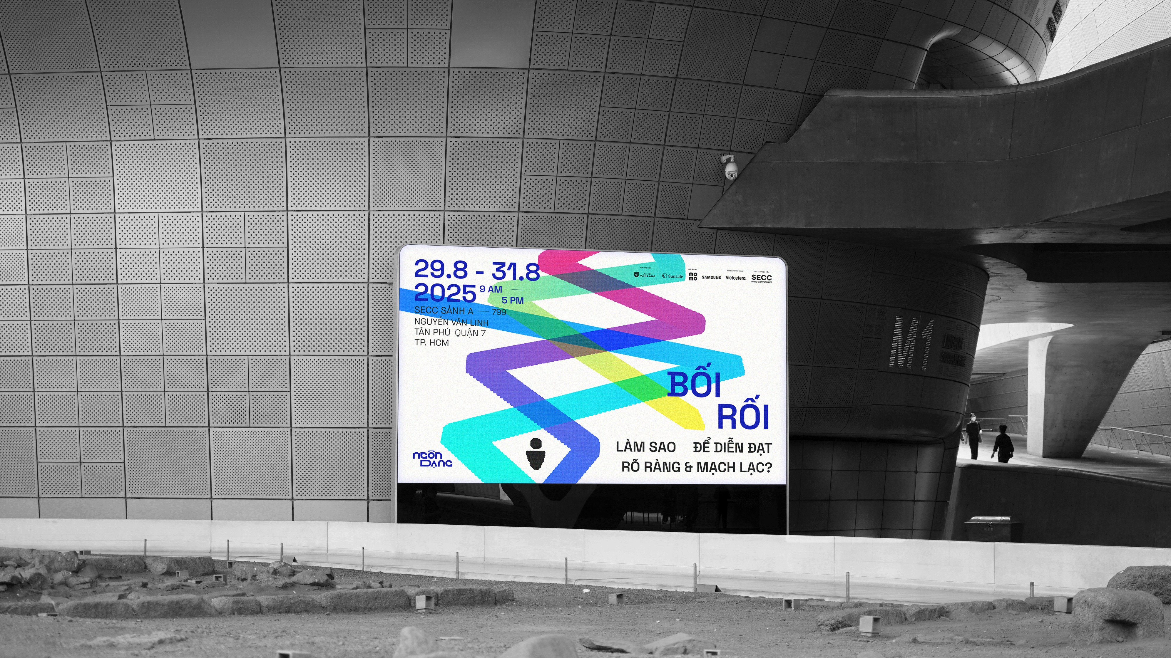
To raise awareness among young people, I developed a modular visual system — a flexible yet distinctive identity for the campaign — that would evoke both diversity and uniqueness in individual communication styles. The deliverables are campaign materials (posters, billboards, and brochures), digital content, and on-site tools such as wayfinding, tickets, and merchandise. Variety and distinction in characters are referenced in every element of the visual identity, from the mix-and-match of bespoke Ngôn Dạng Mono and Space Grotesk, representing verbal communication between people, to the graphic elements: bold, overlapping variations that serve as natural communication strengths in each of us. Meanwhile, the vibrant contrasting color scheme reflects the two distinctive thinking styles, i.e, cool colors for linear thinking and warm colors for configural thinking. From typeface to structure, from posters to tickets, the design narrates an experience that’s both dynamic and individualistic.
Website: https://ngondang.framer.website/ (work best on Macbook)
Communication Styles Test: https://ngondang.framer.website/quiz
Credits
Art Director/Graphic Designer: Do Manh Hung
Mentor: Chieu Anh Long
Advisor: Uyen Dong, Meow Meow, Thai Nguyen, Doan Tram, Dung Ngo
Copy Writer: Bao Khanh
Web Designer: Ngan Nguyen
Design Assistance/Showcase: Dan Tan
Type Concept: Do Manh Hung
Illustrator: Hue Man
Motion Designer: Truc Ly, Minh Hanh
Interior Designer: Minh Quan
Supporter: Tran Khanh, Kim Sun, Nam Phuong, Duc Tien, Hai Dinh
Ngôn Dạng Campaign
Flexible Visual System for promotional campaign to enhance communication skills for gen Z.
Graduation Project
Graduation Project
Typography
Typography
Visual System
Visual System
Education
Education
In a generation where many Gen Z youth are confidently speaking up and shaping the social narrative, the flip side is a tendency to conform to trends and a fear of judgment. This has caused a large number of young people to become hesitant and reserved in expressing themselves. As a result, their unique communication styles gradually fade, and their confidence retreats with it. “Ngôn Dạng” is a campaign that helps you rediscover your communication identity – clearer, deeper, and truly authentic.
In Vietnamese, “Ngôn” reflects how we speak - the essence of language. “Dạng” represents both form and diversity - the many shapes of expression.
“Ngôn Dạng Campaign” explores a variety of personal communication styles, inspired by Dr. Dellinger’s Psycho-Geometrics, where five geometric shapes - Square, Triangle, Rectangle, Circle, and Squiggle - represent different natural communication strengths. This approach serves as the core visual and conceptual foundation for the project.
The campaign concept, “Reflect to ReShape”, draws inspiration from the phenomenon of light bouncing back from a surface. “Reflect”, in this context, is more than a physical process; it represents an inward journey to understand how we communicate with others, whether through habits, preferences, and challenges in communication, and thus, to “ReShape” how we express ourselves — more intentionally, confidently, and true to who we are.
To raise awareness among young people, I developed a modular visual system — a flexible yet distinctive identity for the campaign — that would evoke both diversity and uniqueness in individual communication styles.
The vibrant contrasting color scheme reflects the two distinctive thinking styles, i.e, cool colors for linear thinking and warm colors for configural thinking.
Ngôn Dạng Mono was developed based on a 12x12 grid system derived from the wordmark. The typeface includes full diacritic support for Vietnamese, ensuring consistency and functionality when the campaign is implemented for Gen Z audiences in Vietnam.
The “Pawsonas” are inspired by animals, each representing a distinct communication style. By visualizing these styles through relatable animal traits, the designs help audiences easily identify and connect with different personality-driven communication behaviors.
Inspired by “The Alphabetical Room” by Liad Shadmi, the geometric shapes were created using the Shape Builder Tool on a circular grid system. The randomness of this process allows for unpredictable variations, while overlapping the shapes symbolizes how every individual possesses a unique and distinctive communication style.




CREDITS
Design Director/Graphic Designer: Do Manh Hung
Mentor: Chieu Anh Long
Special Thanks to
Big-size Advisor: Uyen Dong, Meow Meow, Thai Nguyen, Bao Khanh,
Xuan Nguyen
Mini-size Advisor: Doan Tram, Dung Ngo, Anh Thu, Khanh Giang
Copy Writer: Bao Khanh
Web Designer: Ngan Nguyen
Design Assistance/Showcase: Dan Tan
Type Concept: Do Manh Hung
Illustrator: Hue Man
Motion Designer: Truc Ly, Minh Hanh
Interior Designer: Minh Quan
Supporter: Tran Khanh, Kim Sun, Nam Phuong, Duc Tien, Hai Dinh
OTHER CREDITS
Stock Image: Unsplash
Typeface: Space Grotesk by Florian Karsten, Maison Neue by Timo Gaessner
In a generation where many Gen Z youth are confidently speaking up and shaping the social narrative, the flip side is a tendency to conform to trends and a fear of judgment. This has caused a large number of young people to become hesitant and reserved in expressing themselves. As a result, their unique communication styles gradually fade, and their confidence retreats with it. “Ngôn Dạng” is a campaign that helps you rediscover your communication identity – clearer, deeper, and truly authentic.
In Vietnamese, “Ngôn” reflects how we speak - the essence of language. “Dạng” represents both form and diversity - the many shapes of expression.
“Ngôn Dạng Campaign” explores a variety of personal communication styles, inspired by Dr. Dellinger’s Psycho-Geometrics, where five geometric shapes - Square, Triangle, Rectangle, Circle, and Squiggle - represent different natural communication strengths. This approach serves as the core visual and conceptual foundation for the project.
The campaign concept, “Reflect to ReShape”, draws inspiration from the phenomenon of light bouncing back from a surface. “Reflect”, in this context, is more than a physical process; it represents an inward journey to understand how we communicate with others, whether through habits, preferences, and challenges in communication, and thus, to “ReShape” how we express ourselves — more intentionally, confidently, and true to who we are.
To raise awareness among young people, I developed a modular visual system — a flexible yet distinctive identity for the campaign — that would evoke both diversity and uniqueness in individual communication styles.
The vibrant contrasting color scheme reflects the two distinctive thinking styles, i.e, cool colors for linear thinking and warm colors for configural thinking.

Ngôn Dạng Mono was developed based on a 12x12 grid system derived from the wordmark. The typeface includes full diacritic support for Vietnamese, ensuring consistency and functionality when the campaign is implemented for Gen Z audiences in Vietnam.
The “Pawsonas” are inspired by animals, each representing a distinct communication style. By visualizing these styles through relatable animal traits, the designs help audiences easily identify and connect with different personality-driven communication behaviors.
Inspired by “The Alphabetical Room” by Liad Shadmi, the geometric shapes were created using the Shape Builder Tool on a circular grid system. The randomness of this process allows for unpredictable variations, while overlapping the shapes symbolizes how every individual possesses a unique and distinctive communication style.


CREDITS
Design Director/Graphic Designer: Do Manh Hung
Mentor: Chieu Anh Long
Special Thanks to
Big-size Advisor: Uyen Dong, Meow Meow, Thai Nguyen, Bao Khanh,
Xuan Nguyen
Mini-size Advisor: Doan Tram, Dung Ngo, Anh Thu, Khanh Giang
Copy Writer: Bao Khanh
Web Designer: Ngan Nguyen
Design Assistance/Showcase: Dan Tan
Type Concept: Do Manh Hung
Illustrator: Hue Man
Motion Designer: Truc Ly, Minh Hanh
Interior Designer: Minh Quan
Supporter: Tran Khanh, Kim Sun, Nam Phuong, Duc Tien, Hai Dinh
OTHER CREDITS
Stock Image: Unsplash
Typeface: Space Grotesk by Florian Karsten, Maison Neue by Timo Gaessner
In a generation where many Gen Z youth are confidently speaking up and shaping the social narrative, the flip side is a tendency to conform to trends and a fear of judgment. This has caused a large number of young people to become hesitant and reserved in expressing themselves. As a result, their unique communication styles gradually fade, and their confidence retreats with it. “Ngôn Dạng” is a campaign that helps you rediscover your communication identity – clearer, deeper, and truly authentic.
In Vietnamese, “Ngôn” reflects how we speak - the essence of language. “Dạng” represents both form and diversity - the many shapes of expression.
“Ngôn Dạng Campaign” explores a variety of personal communication styles, inspired by Dr. Dellinger’s Psycho-Geometrics, where five geometric shapes - Square, Triangle, Rectangle, Circle, and Squiggle - represent different natural communication strengths. This approach serves as the core visual and conceptual foundation for the project.
The campaign concept, “Reflect to ReShape”, draws inspiration from the phenomenon of light bouncing back from a surface. “Reflect”, in this context, is more than a physical process; it represents an inward journey to understand how we communicate with others, whether through habits, preferences, and challenges in communication, and thus, to “ReShape” how we express ourselves — more intentionally, confidently, and true to who we are.
To raise awareness among young people, I developed a modular visual system — a flexible yet distinctive identity for the campaign — that would evoke both diversity and uniqueness in individual communication styles.
The vibrant contrasting color scheme reflects the two distinctive thinking styles, i.e, cool colors for linear thinking and warm colors for configural thinking.

Ngôn Dạng Mono was developed based on a 12x12 grid system derived from the wordmark. The typeface includes full diacritic support for Vietnamese, ensuring consistency and functionality when the campaign is implemented for Gen Z audiences in Vietnam.
The “Pawsonas” are inspired by animals, each representing a distinct communication style. By visualizing these styles through relatable animal traits, the designs help audiences easily identify and connect with different personality-driven communication behaviors.
Inspired by “The Alphabetical Room” by Liad Shadmi, the geometric shapes were created using the Shape Builder Tool on a circular grid system. The randomness of this process allows for unpredictable variations, while overlapping the shapes symbolizes how every individual possesses a unique and distinctive communication style.


CREDITS
Design Director/Graphic Designer: Do Manh Hung
Mentor: Chieu Anh Long
Special Thanks to
Big-size Advisor: Uyen Dong, Meow Meow, Thai Nguyen, Bao Khanh,
Xuan Nguyen
Mini-size Advisor: Doan Tram, Dung Ngo, Anh Thu, Khanh Giang
Copy Writer: Bao Khanh
Web Designer: Ngan Nguyen
Design Assistance/Showcase: Dan Tan
Type Concept: Do Manh Hung
Illustrator: Hue Man
Motion Designer: Truc Ly, Minh Hanh
Interior Designer: Minh Quan
Supporter: Tran Khanh, Kim Sun, Nam Phuong, Duc Tien, Hai Dinh
OTHER CREDITS
Stock Image: Unsplash
Typeface: Space Grotesk by Florian Karsten, Maison Neue by Timo Gaessner
More projects
More
projects
In a generation where many Gen Z youth are confidently speaking up and shaping the social narrative, the flip side is a tendency to conform to trends and a fear of judgment. This has caused a large number of young people to become hesitant and reserved in expressing themselves. As a result, their unique communication styles gradually fade, and their confidence retreats with it. “Ngôn Dạng” is a campaign that helps you rediscover your communication identity – clearer, deeper, and truly authentic.
In Vietnamese, “Ngôn” reflects how we speak - the essence of language. “Dạng” represents both form and diversity - the many shapes of expression.
“Ngôn Dạng Campaign” explores a variety of personal communication styles, inspired by Dr. Dellinger’s Psycho-Geometrics, where five geometric shapes - Square, Triangle, Rectangle, Circle, and Squiggle - represent different natural communication strengths. This approach serves as the core visual and conceptual foundation for the project.
The campaign concept, “Reflect to ReShape”, draws inspiration from the phenomenon of light bouncing back from a surface. “Reflect”, in this context, is more than a physical process; it represents an inward journey to understand how we communicate with others, whether through habits, preferences, and challenges in communication, and thus, to “ReShape” how we express ourselves — more intentionally, confidently, and true to who we are.
To raise awareness among young people, I developed a modular visual system — a flexible yet distinctive identity for the campaign — that would evoke both diversity and uniqueness in individual communication styles. The deliverables are campaign materials (posters, billboards, and brochures), digital content, and on-site tools such as wayfinding, tickets, and merchandise. Variety and distinction in characters are referenced in every element of the visual identity, from the mix-and-match of bespoke Ngôn Dạng Mono and Space Grotesk, representing verbal communication between people, to the graphic elements: bold, overlapping variations that serve as natural communication strengths in each of us. Meanwhile, the vibrant contrasting color scheme reflects the two distinctive thinking styles, i.e, cool colors for linear thinking and warm colors for configural thinking. From typeface to structure, from posters to tickets, the design narrates an experience that’s both dynamic and individualistic.
Website: https://ngondang.framer.website/ (work best on Macbook)
Communication Styles Test: https://ngondang.framer.website/quiz
Credits
Art Director/Graphic Designer: Do Manh Hung
Mentor: Chieu Anh Long
Advisor: Uyen Dong, Meow Meow, Thai Nguyen, Doan Tram, Dung Ngo
Copy Writer: Bao Khanh
Web Designer: Ngan Nguyen
Design Assistance/Showcase: Dan Tan
Type Concept: Do Manh Hung
Illustrator: Hue Man
Motion Designer: Truc Ly, Minh Hanh
Interior Designer: Minh Quan
Supporter: Tran Khanh, Kim Sun, Nam Phuong, Duc Tien, Hai Dinh
Behance
Behance
Behance


